Meetingbird
Fall 2017
App Design, UI/UX
Redesigning an existing chrome extension into a full fledged mobile app to help on-the-go individuals better plan their daily meetings. For this project I worked with Tanya Agarwal and Candy Wang.
Design Challenge
Everyone has their own schedules and they fill up fast. This makes finding the time to hold meetings more and more difficult. It is common for people to have consecutive meetings with no time in the between for travel or processing information. Having a smarter meeting planner is vital to boost productivity in the fast-paced nature of the urban lifestyle.
Research Findings
We interviewed three working individuals, all of whom said they had to rush to attend the latter of their back-to-back meetings. This is stressful and decreases productivity. They also reflected that successful meetings they’ve attended are usually highly structured with key points as guides.
Building Personas
We built 2 separate personas. One for a meeting attendee and one for a meeting organizer to better understand the problem from both perspectives.
Structuring The App
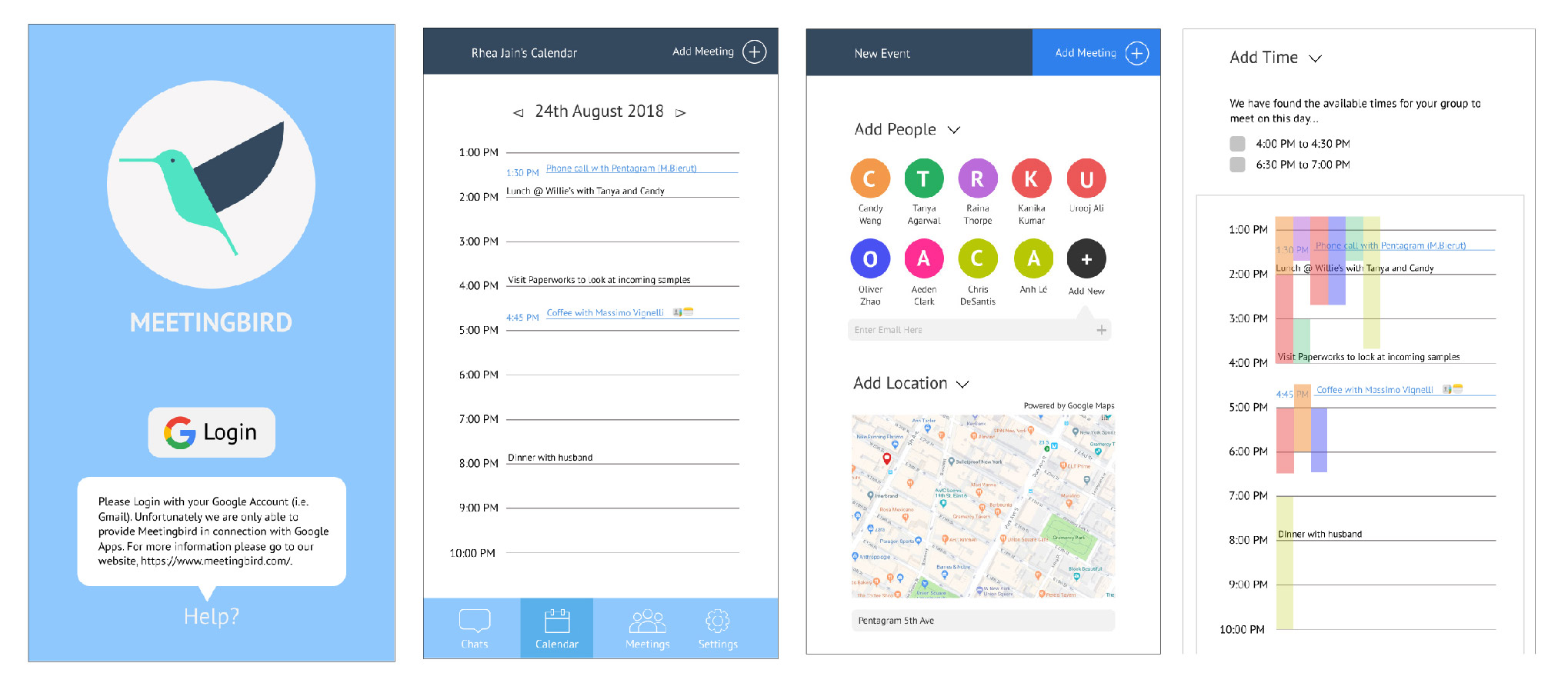
For our initial four sketches, we explored different features we could possibly integrate into the app. We incorporated a checklist, a chat function and an overlay calendar.
Testing Our First Prototype
For this prototype, we focused on putting our proposed features together and designing a cleaner interface. Instead of detailing the screens, we wanted to get the general features of the product out to testing to see its relevance. We sent an interactive prototype to www.usertesting.com and had 3 users test our product.
User Feedback
Out of the three users that tested our product, two of them said that they were highly likely to recommend this interface to a friend or colleague. However all users gave different feedback on how the usability of the interface could be improved by simplifying navigation and streamlining features.
Back To The Drawing Board
After receiving sufficient feedback, we decided to rethink our overall flow. It was clear that we needed a more accessible interface. We began by going back to pen and paper brainstorming and moved on to creating an information architecture. Instead of expanding to have more features, we wanted to narrow the product down to its essentials.
Wireframes
We started with low fidelity wireframes to map out the navigation and layout of each screen. We decided to forego color at this stage which helped us focus more on the functionality of the app.
Final Product
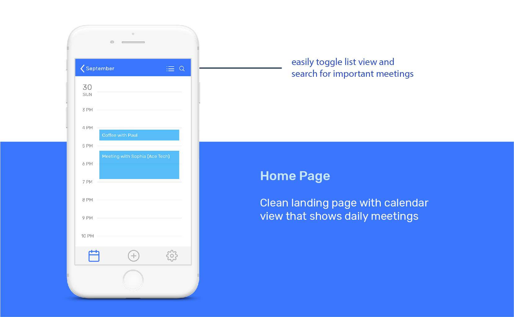
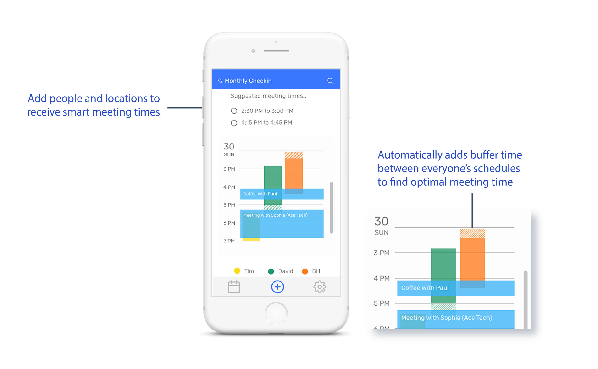
The final screens are high fidelity prototypes which include our color and typography choices.


